
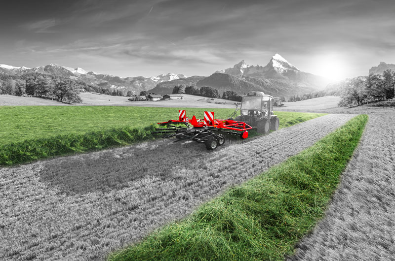
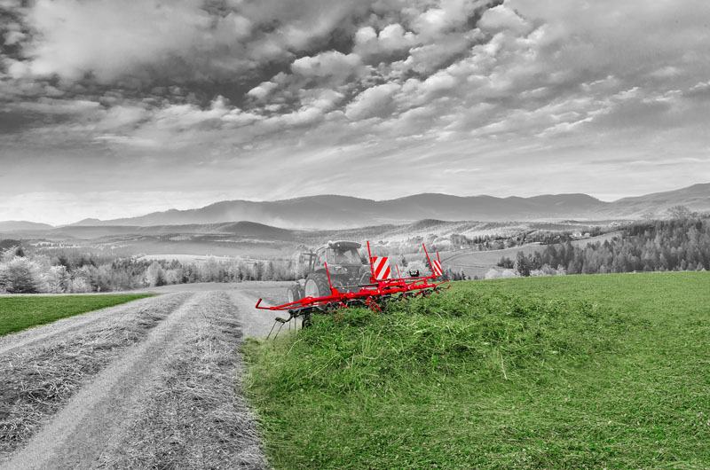
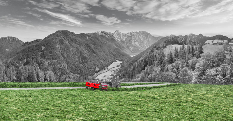
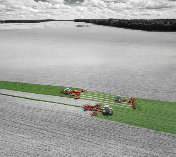
SIP is a very specific brand. That’s why we prepared a very strong corporate visual identity, which is visible through the complete marketing of SIP brand. A strong identity will play an increasingly important role, and we think that SIP will gain its face and awareness at a glance.
The new visual of the corporate communication tries to get as close as possible to these values, the basic colors of the brand and the strong green color is primary for the overall identity in the face of strong competition.
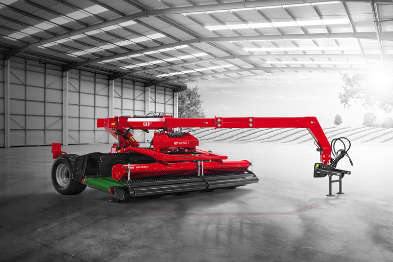
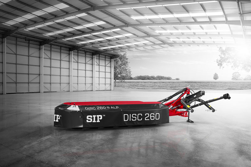
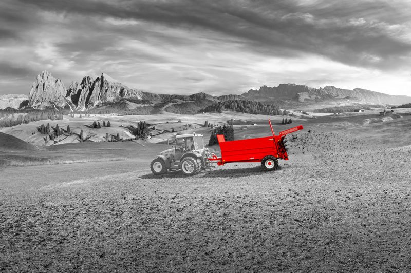
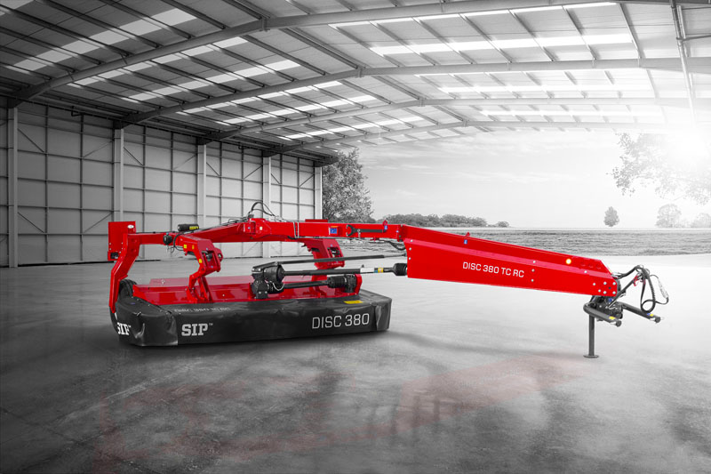
The uniqueness of this style is underlined by the black and white background, which is related to a specific type of machine and thus completes the unique image. In addition, there is no need to retouch the work of the machine, or clean each machine in detail, robustness is one of the pillars of the brand. So in addition to the color adjustments, no major retouching is needed. In today’s digital age, the average person views hundreds of pictures a day.